Best Fonts For Advertising
- Categories Business
- Date 16 February 2023
- Tags Branding, Digital Marketing For Business, Social Media Marketing For Business
Best Fonts For Advertising
Choosing the right fonts for advertising is a big task and requires great care. If you meet any marketer, they’ll tell you how much of a gigantic role design plays in their creatives/ads/content marketing. You can include a wide range of diverse components in your designs to elicit particular feelings. You can make your audience feel a variety of emotions, from happiness to grief to enthusiasm, by using colours, shapes, or layouts. However, there is one aspect of design that is sometimes disregarded but has a significant impact on how your target consumers will feel about your creations: fonts.
Fonts are an effective tool. The fonts you use in your designs significantly impact how your audience will perceive them and the feelings they evoke. You might think, how can something as ordinary and everyday feeling as typography change how consumers perceive your content?
This suggests that typefaces complement products, evoke an emotional reaction, use visual signals to establish expectations about the product, and aid in expressing a product’s underlying meaning. It is now necessary to carefully consider how typography affects our emotions.
A person’s emotional response to an everyday object, a brand, an advertisement, or a sign can be significantly influenced by how it is presented in a specific location. Readers are moved to feel a variety of emotions when diverse typefaces are used in a limitless number of ways. The intended immediate emotional response can differ depending on the typeface graphic designers use to display the same content.
Even the best content with poor typography can instantly turn off a reader, undermining your marketing efforts and costing you time and money. Why should you pick the right fonts for advertising your brand? Does the one the website builder offers to need to function sufficiently? For certain businesses, but not for all of them. Your brand’s image will be enhanced by learning how to select the appropriate font. Additionally, it helps make your business’s mission and values clearer to present and potential clients. That font may affect anything like that may sound absurd, but it’s true!
Different Types Of Fonts
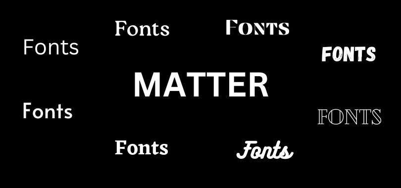
Although there are many different font and typeface styles, most fall into one of four groups: Serif, Sans Serif, Script, and Display. We’ll look at each of these terms definitions and typical applications.
Serif: Timeless and Trustworthy
The first typeface ever made was serif. The little notches at the top and bottom of letters are called serifs. These minor adjustments let the reader distinguish between characters more efficiently, which also improves the legibility of the characters. Serif fonts are the most common and secure choice because they have long been around. These fonts have a more refined and mature appearance. They exude a sense of legitimacy, respect, and trust. Financial institutions, law offices, insurance providers, and consultants benefit from serif fonts. J.P. Morgan, Vogue, and Rolex are well-known companies with logos that feature serif fonts. Businesses frequently use serif fonts for prints, brief titles, and lengthy content pages.
Sans Serif: Contemporary and Sleek
The term “without serif” is “sans serif.” These typefaces have a clean, contemporary, and technologically oriented look since they don’t include feet or other little patterns on the tops and bottoms of the letters. Because of this, sans serif fonts appear more modern than serif fonts. Tech firms, fashion labels, and start-ups are the businesses kinds that employ sans-serif fonts the most. You may have also observed that Google and Facebook, two significant IT businesses, use sans serif in their corporate fonts. Corporations use sans serif fonts for body paragraphs, logos, and headings. They can be challenging to read on printed documents, but they frequently function well on digital media.
Script: Playful and Creative
Cursive, handwriting-based script typefaces include noticeable flourishes and swirls. Script fonts allow for the letters’ linkage, partial linkage, or total disconnection. These are only used in specific situations because they are decorative and sometimes less readable. Businesses usually only use these typefaces for logos and headlines. People perceive script typefaces as amiable, personal, or creative since they are an extension of handwriting. Consider brands like Ford, Kellogg’s, or Coca-Cola. They all use script typefaces in their branding to create an approachable and welcoming atmosphere.
Display: Large and Decorative
Display or ornamental fonts often have no structure and are created for a specific topic or objective. Compared to specific types like serif and sans serif, these typefaces frequently have more eccentric and changeable designs. Businesses only use display fonts for unique headlines or logos, not body text. Display fonts are only used for large-size types to match a specific theme or mood.
Things To Keep In Mind While Selecting Fonts For Ad Campaigns
In the great picture of a campaign, typeface, font, or whatever you choose to call it, is a minor detail, but if it needs to be done correctly, your ads may fail to communicate their intended message. They can turn out to be absurd or just plain perplexing.
Here are some suggestions to help you avoid choosing the wrong typefaces for your upcoming print or web advertisement:
1. Understand The Serif & Sans Serif Font Differences
Consider serifs, small protrusions on some letters, as feet that distinguish each letter from the others (see “A” below). While sans-serif fonts have a more contemporary, urban feel, serif fonts frequently imply stability and tradition.
2. Match Your Message's Visual Fonts
Your typeface should only complement your message rather than overshadow it. If you choose serif fonts, make sure they are easy to read (like Times New Roman). Understand that readers will be too preoccupied trying to figure out what they’re reading to pay attention to your material if you employ too many various font styles or if they’re difficult to read (maybe one is light and another is dark).
3. Use The Same Font Style Across The Entire Piece
You’ve lost readers if they laugh because they find it amusing but need help figuring out what’s wrong. And perhaps even some potential customers if you don’t select the right fonts for advertising! This is particularly true when writing a print piece with a lot of copy. Regarding typography, three is a few, so pick two that go well together (Lobster & Arimo) rather than one at extremes (Playfair Display & Open Sans). Additionally, make sure that the headlines are larger than the body material to stand out on the page.
4. Avoid Using Difficult-to-Read Fonts
The critical thing to remember when selecting typefaces is to keep your readers in mind, even if we’ve probably stated it a thousand times by this point: Your message won’t be understood if people can’t see the beautiful font on the page or if they feel it’s unprofessional-looking. For instance, even though ‘Times New Roman’ is a favourite of many of our clients, it is not really suitable for everyone. One of our faves, Arial, would be an excellent choice for a font! It is concise, readable, and unambiguous. No matter how many words you require, your message will stand out because tons of weights are available.
5. Avoid Blending Various Typography Types Within A Single Language
Readers may find it equally unpleasant and perplexing when font aesthetics are mixed within a single language because each typeface has its own personality and mood. Look at the many luxury brands that consistently employ the readable typeface Helvetica; their websites still has a polished appearance.
6. Keep in Mind the Effects You Can Add
Use handwritten or free typefaces you have photographed as brush scripts, or try Aline type for a more contemporary appearance. Consider layering two of your favourite typefaces, if you’re daring: Together, they’ll create an even larger image. And if all else fails, there are over 800 free, incredibly user-friendly typefaces at Google Fonts! Just abide by our guidelines when selecting your fonts to prevent mistakes.
7. Avoid Using Multiple Languages In the Same Content
Use caution when using both horizontally and vertically set types when constructing a document containing multiple languages, such as English and Chinese. Although doing so can certainly add flair (see the logo below), mixing languages is unprofessional, primarily if your item is intended for commercial use.
To know more about how to select the right fonts for advertising and content marketing, check out our digital marketing courses for students, working professionals, and business owners.
You may also like

SEO Strategies for Multilevel Marketing Success

